
 个人中心
个人中心 文章发布
文章发布
作者热门文章
- html - 出于某种原因,IE8 对我的 Sass 文件中继承的 html5 CSS 不友好?
- JMeter 在响应断言中使用 span 标签的问题
- html - 在 :hover and :active? 上具有不同效果的 CSS 动画
- html - 相对于居中的 html 内容固定的 CSS 重复背景?


 24
24
 4
4


我经常需要制作堆叠条形图来比较变量,而且因为我在 R 中完成所有统计数据,所以我更喜欢在 R 中使用 ggplot2 来完成我的所有图形。我想学习如何做两件事:
首先,我希望能够为每个变量添加适当的百分比刻度线,而不是按计数添加刻度线。计数会令人困惑,这就是我完全取出轴标签的原因。
其次,必须有一种更简单的方法来重组我的数据以实现这一点。这似乎是我应该能够在 ggplot2 中使用 plyR 本地做的事情,但是 plyR 的文档不是很清楚(我已经阅读了 ggplot2 书和在线 plyR 文档。
我最好的图表如下所示,创建它的代码如下:
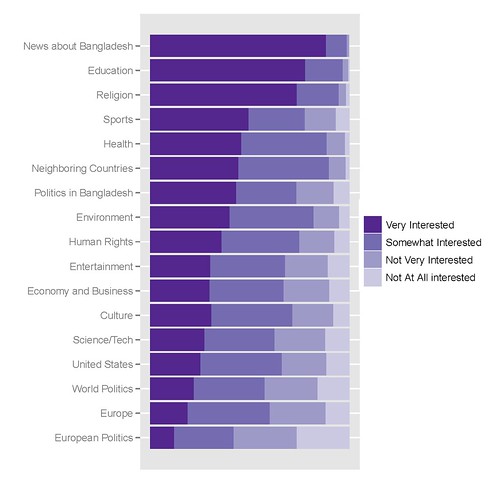
我用来获取它的 R 代码如下:
library(epicalc)

### recode the variables to factors ###
recode(c(int_newcoun, int_newneigh, int_neweur, int_newusa, int_neweco, int_newit, int_newen, int_newsp, int_newhr, int_newlit, int_newent, int_newrel, int_newhth, int_bapo, int_wopo, int_eupo, int_educ), c(1,2,3,4,5,6,7,8,9, NA),
c('Very Interested','Somewhat Interested','Not Very Interested','Not At All interested',NA,NA,NA,NA,NA,NA))

### Combine recoded variables to a common vector
Interest1<-c(int_newcoun, int_newneigh, int_neweur, int_newusa, int_neweco, int_newit, int_newen, int_newsp, int_newhr, int_newlit, int_newent, int_newrel, int_newhth, int_bapo, int_wopo, int_eupo, int_educ)


### Create a second vector to label the first vector by original variable ###
a1<-rep("News about Bangladesh", length(int_newcoun))
a2<-rep("Neighboring Countries", length(int_newneigh))
[...]
a17<-rep("Education", length(int_educ))


Interest2<-c(a1, a2, a3, a4, a5, a6, a7, a8, a9, a10, a11, a12, a13, a14, a15, a16, a17)

### Create a Weighting vector of the proper length ###
Interest.weight<-rep(weight, 17)

### Make and save a new data frame from the three vectors ###
Interest.df<-cbind(Interest1, Interest2, Interest.weight)
Interest.df<-as.data.frame(Interest.df)

write.csv(Interest.df, 'C:\\Documents and Settings\\[name]\\Desktop\\Sweave\\InterestBangladesh.csv')

### Sort the factor levels to display properly ###

Interest.df$Interest1<-relevel(Interest$Interest1, ref='Not Very Interested')
Interest.df$Interest1<-relevel(Interest$Interest1, ref='Somewhat Interested')
Interest.df$Interest1<-relevel(Interest$Interest1, ref='Very Interested')

Interest.df$Interest2<-relevel(Interest$Interest2, ref='News about Bangladesh')
Interest.df$Interest2<-relevel(Interest$Interest2, ref='Education')
[...]
Interest.df$Interest2<-relevel(Interest$Interest2, ref='European Politics')

detach(Interest)
attach(Interest)

### Finally create the graph in ggplot2 ###

library(ggplot2)
p<-ggplot(Interest, aes(Interest2, ..count..))
p<-p+geom_bar((aes(weight=Interest.weight, fill=Interest1)))
p<-p+coord_flip()
p<-p+scale_y_continuous("", breaks=NA)
p<-p+scale_fill_manual(value = rev(brewer.pal(5, "Purples")))
p
update_labels(p, list(fill='', x='', y=''))
最佳答案
您的第二个问题可以通过 reshape 包中的熔体和类型转换来解决
在你考虑了你的 data.frame 中的元素之后,你可以使用类似的东西:
install.packages("reshape")
library(reshape)

x <- melt(your.df, c()) ## Assume you have some kind of data.frame of all factors
x <- na.omit(x) ## Be careful, sometimes removing NA can mess with your frequency calculations

x <- cast(x, variable + value ~., length)
colnames(x) <- c("variable","value","freq")
## Presto!
ggplot(x, aes(variable, freq, fill = value)) + geom_bar(position = "fill") + coord_flip() + scale_y_continuous("", formatter="percent")
x <- your.df[,grep("int.",df)] ## pulls all columns starting with "int_"
for(x in 1:ncol(x)) {
df[,x] <- factor(df[,x], labels = strsplit('
Very Interested
Somewhat Interested
Not Very Interested
Not At All interested
NA
NA
NA
NA
NA
NA
', '\n')[[1]][-1]
}
关于r - 如何更好地从 ggplot2 创建具有多个变量的堆叠条形图?,我们在Stack Overflow上找到一个类似的问题: https://stackoverflow.com/questions/2578961/
24
4
 0
0
如何将单元格(在 UICollectionView 中)堆叠在一起? Feedly 做得很好,我想知道是否可以以某种方式操纵 zIndex 属性以在 UICollectionView 的导航中获得类似
我正在尝试堆叠 div 以使用和图像显示顶部和底部淡入淡出。 外部 div(“旋转器”)有一个背景图像,该图像在顶部和底部具有渐变,在中间是透明的。在中间,我想显示内容或图像,并将外部 div 背景图
我有两个动画(在 CSS 中)div,它们围绕彼此旋转。我想在中间为文本添加另一个 div。但是,如果我将 div 放在这两个中的任何一个中,它就会与父 div 一起设置动画。如果我尝试定位它,它就位
图中显示了我想要的 View 。 最佳答案 为此你可以采取 FrameLayout . 例如 - 1: 更新: 例如 - 2:精湛的示例和技巧,可在此处找到:http://w
使用 tf.keras.layers.RNN 的 TensorFlow (1.13.1) 中多层/堆叠 RNN 的初始状态所需的结构是什么? API? 我尝试了以下方法: lstm_cell_size
我在制作条形图时遇到问题,其中 y 轴不是计数,而是变量的值。 我使用stat=identity,这对于一个变量来说很好。但是,如果我有两个变量并且想要创建堆叠/闪避条形图怎么办? 我这里有一些模拟数
我有一个栅格路径列表(rplist = 912 raster pathe for 912 rasters (19yeras)(12months)(4weeks))如下: [1] "C:/Users
我已经完成了一个项目,现在需要更改该项目,以便在变量位于数组中时显示一个 div,如果变量不在数组中则显示另一个 div。 通常我会这么做 祝你愉快,但是我得到的代码已经包含大量 html 和 ph
我在制作条形图时遇到问题,其中 y 轴不是计数,而是来自变量的值。 我使用 stat=identity,这对一个变量来说没问题。但是,如果我有两个变量并想创建一个堆叠/闪避条形图怎么办? 我这里有一些
我有一个栅格路径列表(rplist = 912 raster pathe for 912 rasters (19yeras)(12months)(4weeks))如下: [1] "C:/Users
我正在尝试将分数和耗时标签(scoreAndTimer)添加到我已经工作的贪吃蛇游戏代码中。问题是当我使用 ScoreAndTimer.setText(); 时它与之前的文本堆叠在一起。 我尝试 se
有没有办法将 GTK+ 小部件放入堆栈中? IE。在标签上放置一个按钮,使按钮覆盖标签的一部分。 最佳答案 您可以使用 GtkFixed 作为布局。这将允许您控制子小部件的确切位置,并且它们可以重叠。
我有以下代码: for (Map.Entry e : classes.entrySet()) { ClassReader reader = e.getValue(); ClassWri
我正在尝试根据类别的计数(或比例)更改我的(堆叠)条宽,作为示例,我使用了钻石数据集。我想根据每个类别(变量 cut )的频率看到不同的宽度。我首先创建了一个变量 cut_prop然后用下面的代码绘制
我目前正在 UWP 中开展一个项目,我有一个 CommandBar,我想将其从 Hidden 变为 Compact 如果鼠标移动。五秒钟后(如果鼠标不移动)CommandBar 应该再次返回到Hidd
我是 Swift 新手,并尝试在学习过程中编写一本交互式书籍。我使用 CATransform3DMakeRotation 创建了封面效果。 正如您所看到的,当我堆叠 View 时,问题就出现了。如果我
我已经阅读了 finish(); 命令和 FLAG_ACTIVITY_CLEAR_TOP 命令,还查看了 Common Ware 关于终止应用程序的回答,但我不确定如何放置这进入我的应用程序。 基本上
在我的引擎中,我从成对的顶点/像素着色器文件中加载 Cg 着色器。我希望能够堆叠着色器以组合它们(照明+ Material 等)。除了将着色器分解为单独的函数然后从中创建单个着色器脚本字符串之外,您是
我有一个 Activity 应该自行完成并关闭应用程序。现在,在某些情况下,根据用户导航到 Activity 的方式而变化, Activity 正在堆叠。当 Activity 堆积时,然后调用 fin
我有 10 个具有完全相同的列和数据类型的 csv 文件。什么是最快/最有效的堆叠方式? CSV1: col1 | col2 | col3 1 | 'a' | 0.1 2 | 'b'

我是一名优秀的程序员,十分优秀!